Ely is just a short train journey from Cambridge, where we live, so it is easy to do in a day.
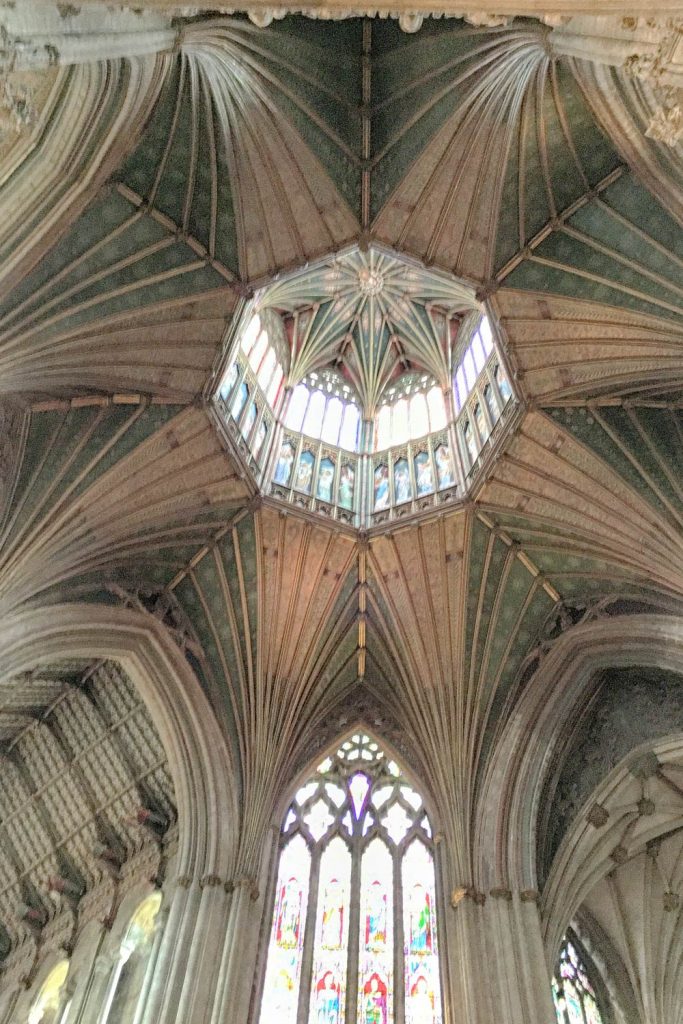
This is the lantern in the cathedral, and it’s just a quick shot on my phone. Next time I go I will set up something with my camera to get a better shot, but maybe even then I will not be able to capture the Wow! factor.
And it is a big Wow! Looking up and seeing the lantern set into the roof with the light streaming in, and the fact that the whole thing is made of wood and seems suspended on slender struts, makes it well worth seeing.
From Wikipedia
The central octagonal tower has eight internal archways that lead up to timber fan-vaulting that appears to allow the glazed timber lantern to balance on their struts.
The central lantern has panels showing pictures of musical angels, which can be opened, with access from the Octagon roof-space, so that choristers can sing from there.
That must be something – choirboys singing ‘up in the heavens’.
Getting There From The Station
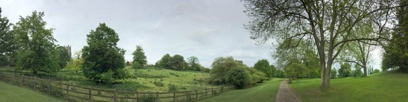
There are a couple of roads to the cathedral that lead up from the railway station. I asked a nice woman which way to go and she said both ways were equidistant (what a lovely word) and she recommended that instead of either of these roads, that I walk up through the park. You can see the cathedral up on the hill in this view from the park.
It’s hiding behind the trees on the left of the shot.
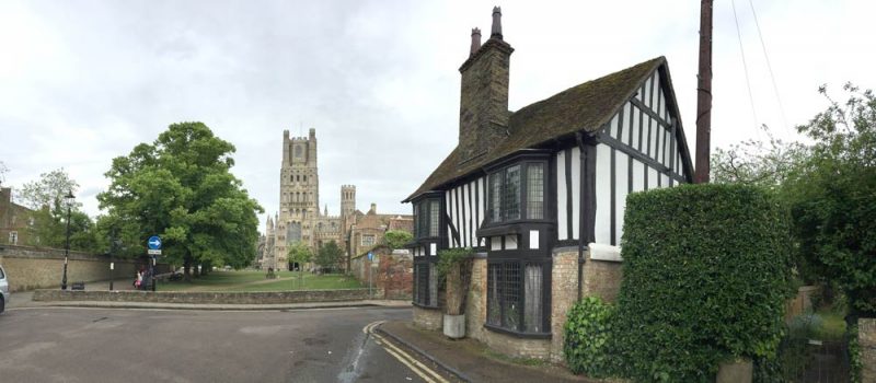
Ely is set in the fens – a flat area of England that was under water until drained in the 1600s. A man I met near the cathedral mentioned that the cathedral is known as the battleship of the fens because of the way it sticks out on the horizon against the otherwise flat landscape.
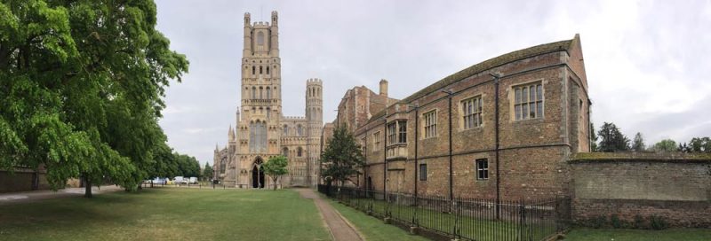
And here are a couple of shots of the cathedral from the ‘top’ of the town. The long brown building to the right of the cathedral in the second shot is The Old Bishop’s Palace.
There is a plaque on the fence in front of the old palace that says:
The Old Bishop’s Palace, built by John Alcock in 1486 and was home of the bishops of Ely from then until 1941. From 1588-1597 it was also a prison for 32 Catholic recusants.
I had no idea what a recusant was, and wondered whether it had any connection with the verb to recuse (to remove oneself from participation in) and have just now found the definition.
A recusant is
‘a person who refuses to submit to an authority or to comply with a regulation.’
Wikipedia gives a fuller explanation:
Recusancy was the state of those who refused to attend Anglican services during the history of England and Wales; these individuals were known as recusants. The term, which derives ultimately from the Latin recusare (to refuse or make an objection) was first used to refer to those who remained loyal to the pope and the Roman Catholic Church and who did not attend Church of England services, with a 1593 statute determining the penalties against “Popish recusants”. The “Recusancy Acts” began during the reign of Elizabeth I and were repealed in 1650.
So the repeal was a year after the execution of Charles I (who was an Anglican).
Here is Wikipedia again on the religious views of Charles I.
His religious policies, coupled with his marriage to a Roman Catholic, generated the antipathy and mistrust of reformed groups such as the English Puritans and Scottish Covenanters, who thought his views too Catholic. He supported high church ecclesiastics, such as Richard Montagu and William Laud, and failed to aid Protestant forces successfully during the Thirty Years’ War. His attempts to force the Church of Scotland to adopt high Anglican practices led to the Bishops’ Wars, strengthened the position of the English and Scottish parliaments and helped precipitate his own downfall.
Charles I came to the throne in 1625 after the death of James I and VI (that’s one person with two titles that refer to the English and Scottish crowns), and was monarch until his execution in 1649.
And here is how Oliver Cromwell fits into the picture. In 1636 Cromwell inherited control of various properties in Ely from his uncle, as well as his uncle’s job as tithe collector for Ely Cathedral.
And of course it was Oliver Cromwell who led the Republican revolution against the monarchy and had Charles I executed for high treason.
Scottish Prisoners Drain The Fens
Oliver Cromwell’s house is now the tourist information office, and I picked up a book there about Scottish prisoners captured during the English Civil Wars being sent out to work to drain the fens. I’ve only just started it, but I googled around for more information and found that the Third English Civil War (1649–1651) was the last of the English Civil Wars, that had begun in 1642, between Parliamentarians and Royalists.
The war ended at the battle of Worcester when Cromwell’s New Model Army defeated the Royalists under Charles II.
Charles’ army of 16,000 who fought at Worcester included 14,000 Scots, so as the Royalist army was mostly Scottish, and as there was no major rising or support of the Royalists in England, historians have described the war as an Anglo-Scottish War rather than the last gasp of the English Civil War.
After Cromwell’s death there was total confusion that ended with the restoration of the monarchy in 1660. (I have sometimes wondered how that ever happened.)
An American Tribute To The Battle Of Worcester
In 1786, John Adams and Thomas Jefferson visited the battlefield at Worcester. John Adams wrote that he was deeply moved but disappointed at the locals’ lack of knowledge of the battle, and gave a lecture to the townspeople, noting:
‘The people in the neighborhood appeared so ignorant and careless at Worcester that I was provoked and asked ‘And do Englishmen so soon forget the ground where liberty was fought for? Tell your neighbors and your children that this is holy ground, much holier than that on which your churches stand. All England should come in pilgrimage to this hill, once a year.
Charles, Prince Of Wales Settles An Old Debt
Before the battle of Worcester, King Charles II bought uniforms for his army from the Worcester Clothiers Company. Having lost the battle and the war, he couldn’t pay the £453.3s bill. He escaped to France after the battle, and didn’t not return to England for nine years, until after the death of Oliver Cromwell in 1658.
Despite being restored to the throne, Charles II didn’t repay his debt and the debt remained unpaid until 2008 when Charles, Prince of Wales paid off the 357-year-old debt (without interest).